The CEO and co-founder of Sosido Networks (Tanis Steward) came to LiFT to revisit the design of a web application that she had worked on with Chris several years ago which had successfully launched and secured an audience. It was exciting to have the opportunity to pick a project back up with a former client after it’s initial success and update the User Experience and visual design based upon the reactions from users working with the app for a few years.
What is Sosido?
The Sosido web application provides a consolidated information source of industry and association news feeds for medical professionals to read in one aggregated and manageable stream of news updates and conversations. Tanis has 10+ years working directly with medical professionals via several different medical associations and observed the regular frustration of not being able to keep up with the flow of required professional reading and association updates. The medical professional she was encountering simply did not have the technical expertise or time to hunt down all the various online news feeds that they have to follow or association updates sent via PDF or email newsletter. The first iteration of the application met the needs of the association and its members and then Tanis was able to secure funding for further development with an industry sponsor. Enter LiFT and v2 of Sosido…
AUDIENCE
The audience for Sosido was the members of medical associations which included but was not limited to doctors, nurses, medical support staff, pharmacists, etc. The application had to be sensitive to the in-person dynamics that can occur among medical professionals and not serve to reinforce any existing stereotypes. We had to figure out the tone of the application in order to appropriately craft the semantics that would be used for all labeling throughout the site. The site had to be warm and informative but not cheeky or too hip.
Industry partners had to find the site attractive for future investment and were to be provided with a way to support and encourage the ongoing, necessary communication between medical professionals as new discoveries in research and best practices had to be delivered.
As mentioned above, the audience had constraints of being non-technical, time constrained and overloaded by information simply due to their chosen profession, making it easy to access and consume had yet to be presented to them…until Sosido.
Research
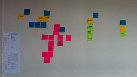
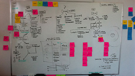
After working through several small personae with Tanis, we moved to discovering the macro-pattern that would best suit the delivery of information. Establishing a macro pattern that maps across all sections of the app makes an interface more ‘learnable’ for users, especially ones that were identified as non-technical. We first explored the semantic structure of the information through a combined white-boarding and sticky-note process to identify the available information, grouping it accordingly and prototyping the possible flow through the information well before discussing any interface elements. The goal was to identify the clearest path to the goal and then design the interface to meet the established path.

From our initial content gathering discussion with Tanis we had an initial labeling/categorization to work from but was not quite working in our minds. So we did our thing and looked at it from the top down and the bottom up to see what the patterns would emerge and where the similarities lie. We looked at the semantics (labeling) of the site from the top down (Global Navigation) and then looked at the type of information we had to arrange from the bottom up (Content inventory). Upon comparing the patterns we found clarity in the pattern that we were going to explore and had a narrative to explain how we got there.

User Experience Design (UXd)
Once we arrived at the high level flow of information and how it was related, we moved to setting up user flows and then wireframes. The wireframing phase was particularly fun because we decided to present Tanis with some more familiar design patterns and a few innovative and interactive patterns that would push the boundaries of the way this information would typically be delivered. It’s always a challenge to step away from a design pattern that you regularly see being used but we always have to consider if there is a different way to convey the information in a way that could be more engaging to the person consuming it. We really hoped the innovative approach would sway Tanis but, although she voiced her appreciation for the willingness to step outside the box, she preferred that we stuck to more traditional design patters and that’s the route we took. By going through that exercise we were able to have the client validate the design that she was most comfortable with which established great constraints for moving forward with the designs. With the macro-pattern decided it was time to dig into the details of the user experience and define the specific interactions that needed to be in place to navigate, consume & share the information.
A wrinkle in our process…
Yep, it happens. Sometimes we have to rearrange our flow to meet the needs of the business goals and timing for the project. In this case we were asked to design an email newsletter prior to designing the actual web application interface. Typically we would start with the application design to establish the look and feel, which would cascade down to any other extensions of the application, like a newsletter.
Nevertheless the newsletter was designed first because it was to precede the launch of the application itself. In hindsight, designing a simpler stand-alone component of a project first helped us focus on achieve just the right look and feel. We experimented with a variety of color treatments and typographic styles in the newsletter format first which made focusing on the brand identity development.
BRAND
While designing the newsletter we came to the realization that Sosido’s existing brand was not appropriate for the identified audience so we proposed realigning the Sosido brand. This realignment became more of a full redesign yet we keep the identity to a simple typographic treatment of the name with light but contrasting color scheme.
INTERFACE DESIGN
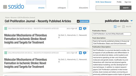
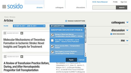
The interface received it’s initial look and feel from the newsletter design but had to be expanded to meet the needs of the content and interactive elements that were designed in the wireframing phase. There was an important balance that had to be maintained between the site not being to “techie” in language and interaction and not to cold and clinical in how it felt to interact with the site. When we boiled it down it had to be a pleasurable experience but not playful and still be very informative. We took inspiration from several medical industry publications and some high end, minimalist architectural journals to derive the aesthetic you see today on the site. ‘Elegant’ might be the best word to describe the tone we were aiming for and rhythm of browsing the publications.


Tech
LiFT did not implement this site.


Blog